Hue You Are: Using Strategic Color-Blocking to Command Every Room You Enter
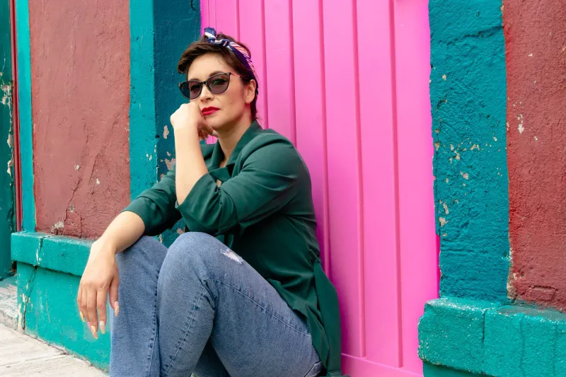
You've felt it before — that specific kind of confidence that comes from wearing a color that just hits. It's not vanity. It's neuroscience.
Color affects how we're perceived before we say a single word. It shifts the way we carry ourselves. It literally changes how other people's brains process us. And when you start placing colors with intention rather than instinct, you move from getting dressed to making a statement — every single day.
Color-blocking, done strategically, is one of the most powerful tools in a personal style arsenal. Not the '80s version of clashing panels for shock value, but the modern, considered approach: using deliberate hue placement to direct attention, create proportion, and project exactly the energy you want to lead with.
What Your Brain Does with Color
Color psychology isn't soft science — it's a legitimate field with decades of research behind it. We know that warm colors (reds, oranges, yellows) activate the sympathetic nervous system, increasing heart rate and creating a sense of urgency or energy. Cool colors (blues, greens, purples) do the opposite — they signal calm, authority, and trustworthiness. Neutrals read as sophisticated and controlled.
More specifically to fashion: studies in social psychology have found that people in high-contrast outfits are remembered more easily, perceived as more confident, and rated as more competent in professional settings. Contrast creates visual clarity. Visual clarity reads as intention. Intention reads as power.
This is why a perfectly tailored black-and-white look hits differently than the same silhouette in all beige. The contrast is doing psychological work.
The Placement Principle
Here's where strategic color-blocking gets interesting. It's not just about which colors you wear — it's about where you put them on your body.
Drawing the eye up: Placing your boldest color at or above the collarbone — a vivid blazer, a saturated top, a bright scarf — directs attention to your face and creates a commanding presence. This is the formula for rooms where you need to be heard. Think board meetings, first dates, speaking engagements.
Creating length: A monochromatic or tonal look from waist to floor creates a continuous vertical line that reads as tall and streamlined. Breaking this line with a contrasting belt or a different-colored bottom interrupts the eye and creates horizontal emphasis instead. Neither is better — they just do different things.
The power center: Placing a bold color at the core of the body — a bright midi skirt, a saturated trouser — grounds the look and projects stability. Stylists often use this formula for clients who want to convey authority without aggression. It's confident without being confrontational.
Framing with contrast: Pairing a bold interior color with a darker or neutral outer layer — a cobalt dress under a charcoal coat, for instance — creates a framing effect that makes the inner color feel curated rather than loud. This is the formula for looking intentional rather than maximalist.
Formulas for Real Life
Let's make this practical. Here are four color-blocking scenarios worth building into your rotation:
For a high-stakes work day: Deep cobalt or forest green top, tailored black trousers, clean white or bone shoes. The bold color is contained to the upper body, drawing attention to your face and voice. The dark bottom grounds the look. You read as composed and in control.
For a creative event or opening: Two unexpected colors that share an undertone — think burnt sienna and dusty rose, or electric blue and warm violet. Colors that technically clash but share a warmth or coolness feel intentional rather than accidental. This is the formula for looking like someone with a genuine point of view.
For a casual Saturday that still feels like you: Neutral base (white, cream, camel) with one saturated accent — a bright bag, a bold shoe, a vivid outer layer. You're not fully committed to a look, but the pop of color signals that you're not on autopilot either.
For formal occasions: Tonal color-blocking — two shades of the same hue, like a blush top with a deeper rose skirt — creates visual interest without disrupting the elegance of the silhouette. It's subtle enough for formal contexts, sophisticated enough to be memorable.
Skin Tone, Undertone, and the Myth of Rules
A quick note on the "certain colors work for certain skin tones" conversation: the rules are looser than you've been told. Undertone matters more than depth — if your skin has warm undertones (yellow, peachy, golden), warm-toned colors will harmonize with you. If you run cool (pink, blue, neutral), cool hues will do the same.
But contrast is the real variable. High-contrast individuals — dark hair, light skin, or vice versa — can carry high-contrast color combinations more easily. Lower-contrast individuals may find that softer transitions between hues feel more balanced. Neither is a limitation. Both are a starting point.
The actual rule? Wear what makes you feel like the most alive version of yourself. The psychology follows the confidence, not the other way around.
Color as Communication
Here's the thing nobody tells you about getting dressed with intention: it changes how you move through the day. When you put on a color you chose deliberately — not because it was clean, not because it was safe, but because it says something specific — you carry that intention with you.
You stand differently. You initiate conversations you might otherwise have avoided. You take up space.
That's not magic. That's what happens when your outside matches your inside. Color-blocking, at its best, isn't about looking put-together. It's about showing up on purpose — and making sure the room knows it before you've said a word.